Triply
- Role
- Design & front-end build
- Timeline
- Sep – Nov 2026
- Platform
- Web
- Status
- Live
- Built with
- HTML · CSS · JavaScript · Node
Introduction
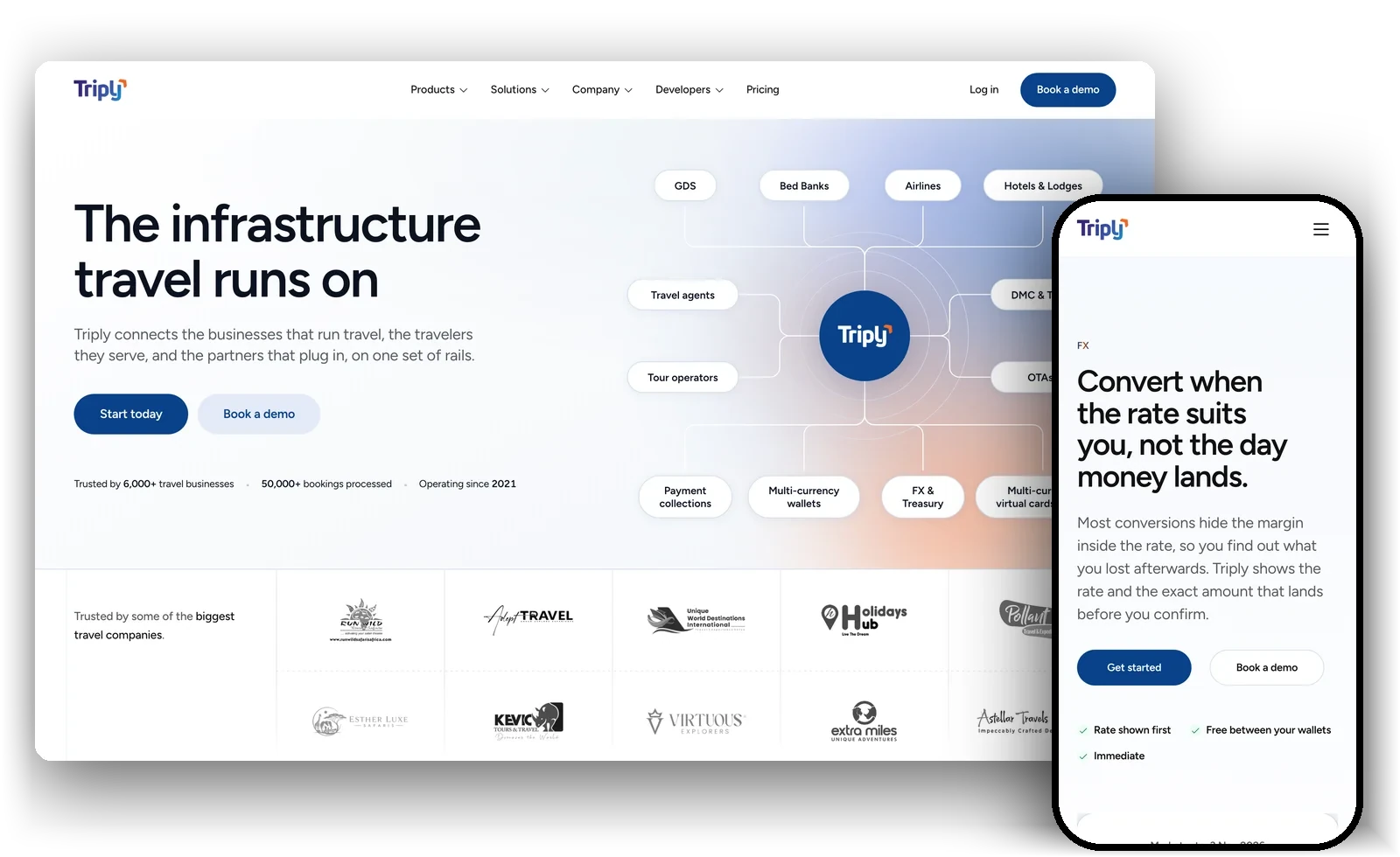
A website for the payments platform behind African travel businesses, where every claim had to be true before it shipped. Triply runs payments, multi-currency wallets, booking tools and a flights and hotels marketplace for travel agents, tour operators, OTAs, airlines and lodges across Africa. The people who read its website are finance leads and founders deciding whether to trust Triply with their clients’ money.
I designed and built the new site with Triply’s team. It started on 10 September as two pages, Home and About. It is now more than forty pages, one for each product, segment and company topic.
01The problem
A trust decision, sold on a website.
Choosing a payments provider is a procurement decision. A travel agency moving its deposits onto Triply needs to know who holds the money, what is regulated, and what happens when a card payment is disputed. The site had to answer those questions plainly, with numbers, before anyone asked for a call.
One site also had to speak to six kinds of business at once. A safari operator and an airline’s revenue team read the same homepage, so it couldn’t lean on one segment’s vocabulary or on regional slang.
Say the number or don’t make the claim.
Triply website voice rules
02Words first
The copy was settled before the layouts.
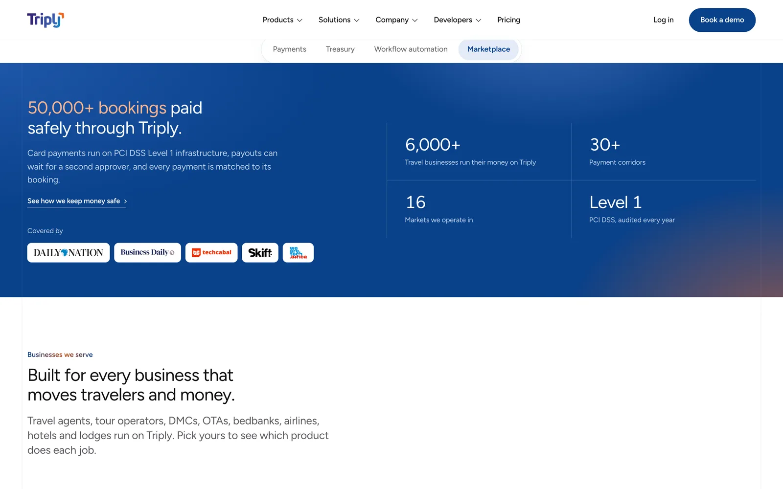
Two days of copy workshops in September produced a written decision log before any page was designed. Every claim on the site traces back to it, and a missing number is marked as missing rather than estimated.
- 01
No invented evidence.
No made-up customers, quotes, logos, press or figures. An empty slot marked as empty is acceptable, because a plausible invention ships as if it were true. Stock photos could hold a layout while real photography was shot, but a caption under them could not name a person or an event.
- 02
Answer the objection on the page that raises it.
Chargebacks are answered on Payments. Margin, cancellations and failed bookings are answered on Marketplace. Prefunding is answered on Treasury. A reader shouldn’t have to book a call to learn what happens when something goes wrong.
- 03
Two button labels, and no others.
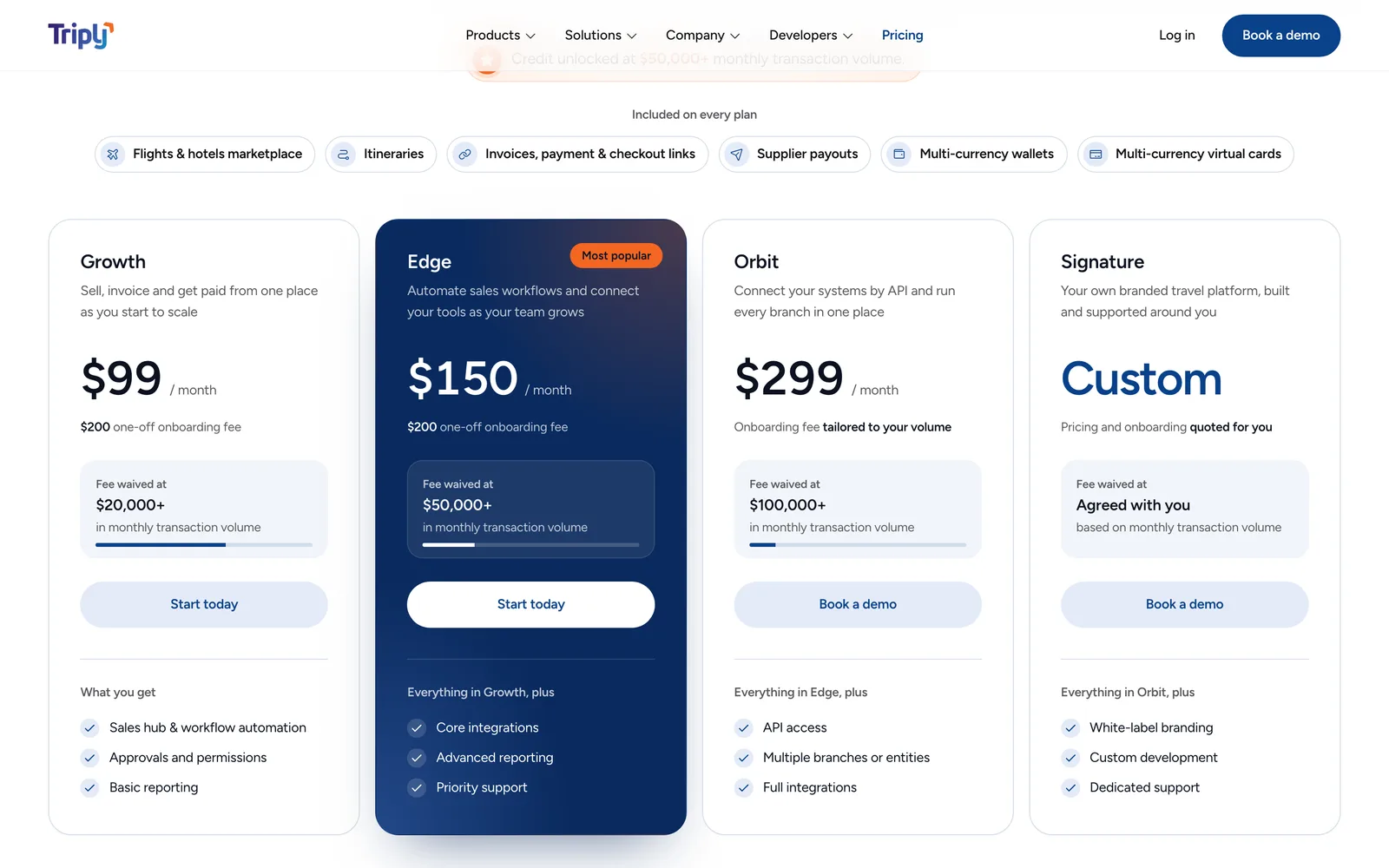
The first rule was “Book a 20-minute demo” everywhere. It didn’t survive the pricing page. Offering a $99 plan and then asking for a meeting puts a step in front of someone who is ready to sign up. Self-serve plans now say “Start today”, and anything that needs a conversation says “Book a demo”.
- 04
Headlines quoted exactly as published.
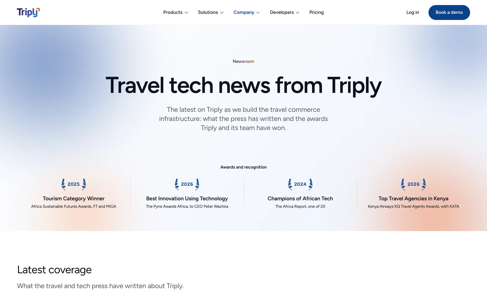
The newsroom lists real coverage with each outlet’s headline exactly as printed, including its title case. A headline is someone else’s words, so it isn’t ours to restyle.
03Direction
Research overruled my first hero.
My first build opened with type alone, with a booking record set out as a table further down the page. Before going further, I went through about fifty live payments and travel sites on Mobbin, including Stripe, Ramp, Wise, Revolut and TravelPerk.
Nobody credible in this category ships a type-only hero.
Design direction notes
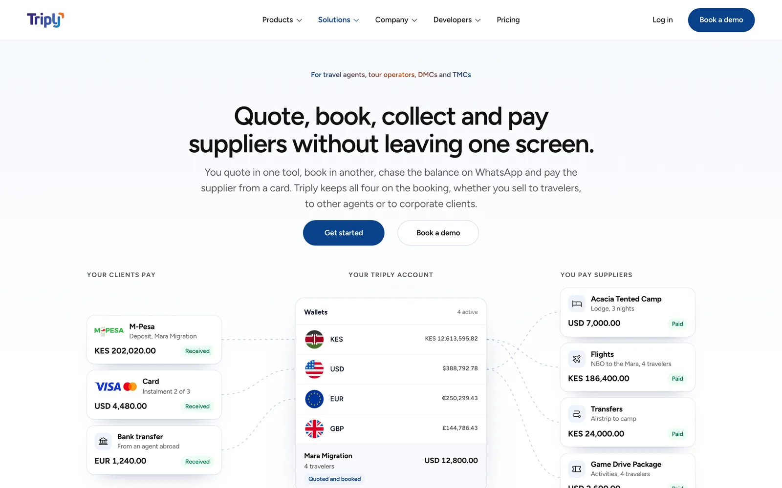
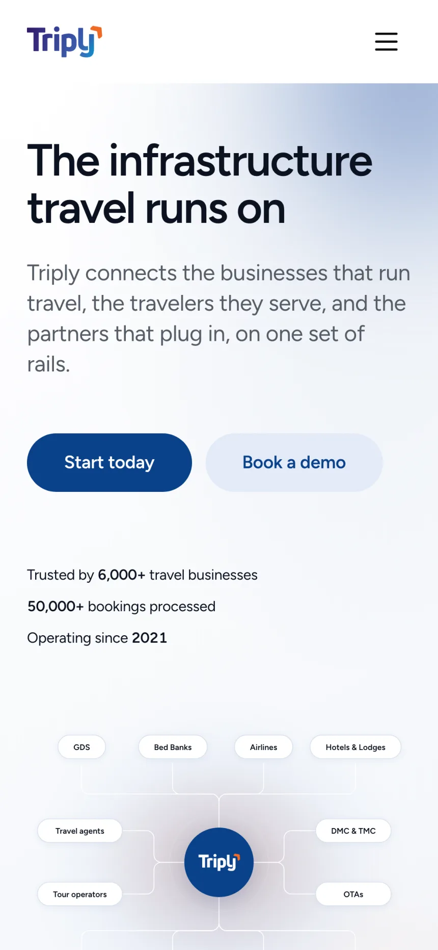
The pattern that kept coming up was small pieces of real product, lifted out and floated beside the headline, carrying real names and amounts. Triply already had the right material in its booking records. The homepage now leads with the network itself: the businesses that sell travel on one side, the suppliers on the other, and Triply’s products in between.
The research also ruled things out. The serious sites show documentary photography of commerce actually happening, not jeeps at sunset, and they put real logos under the hero. Both went on the list and waited for real assets. Both are on the site now.
04The bar
Measuring the reference instead of describing it.
The quality bar I was aiming for was MetaLab. Rather than describe it from memory, I measured the live site: four type sizes with nothing between 20 and 88 pixels, a very light display weight, two corner radii, and colour that arrives only through imagery. Triply had twelve type sizes and eight radii at the time.
What transferred was the discipline: a sparse scale with one big jump, a light weight at display size, quiet chrome. The aesthetic didn’t transfer. MetaLab is an agency performing for creative directors on near-black. Triply is sold to a procurement panel under a hard accessibility floor, and copying the look would have failed both.
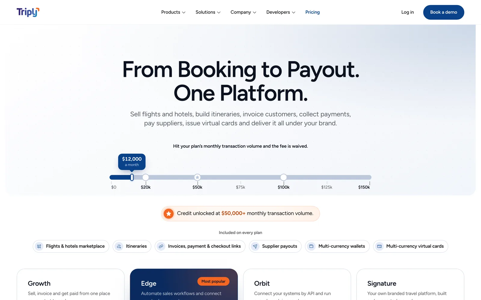
Pricing is a good example of the bar applied. One volume slider does the work of a comparison table: drag it to your monthly volume and it shows where each plan’s fee is waived and where credit unlocks. The four plans sit directly under it, and the monthly and yearly toggle came out.
05Accessibility
A contrast check that couldn’t fail.
Triply’s orange fails as small text on light grounds, at 2.66:1 on the warm ground the first build used. So orange became a non-text accent, and a darker orange token carries small orange text. On the navy footer the full orange passes, by only about one percent, so neither colour can be nudged without re-checking that pair.
The focus ring was the real lesson. It was orange too, which failed the 3:1 rule for non-text contrast on most of the page. My first audit reported zero failures, but it had only checked text. When I extended it to focus rings, it again reported zero, and that was a false pass. It moved focus with a script, which doesn’t trigger the browser’s focus-visible style, so there was no ring to measure.
The fix was to make the ring a token that each background redefines, and to have the audit read that token instead of waiting for a ring to be drawn. Then I put the old colour back to prove the check could fail.
206
focus states audited on the first pages, menus and dialogs
77
failures found when the old ring was put back
0
failures with the fix, worst case 4.55:1
06Scale
From two pages to more than forty.
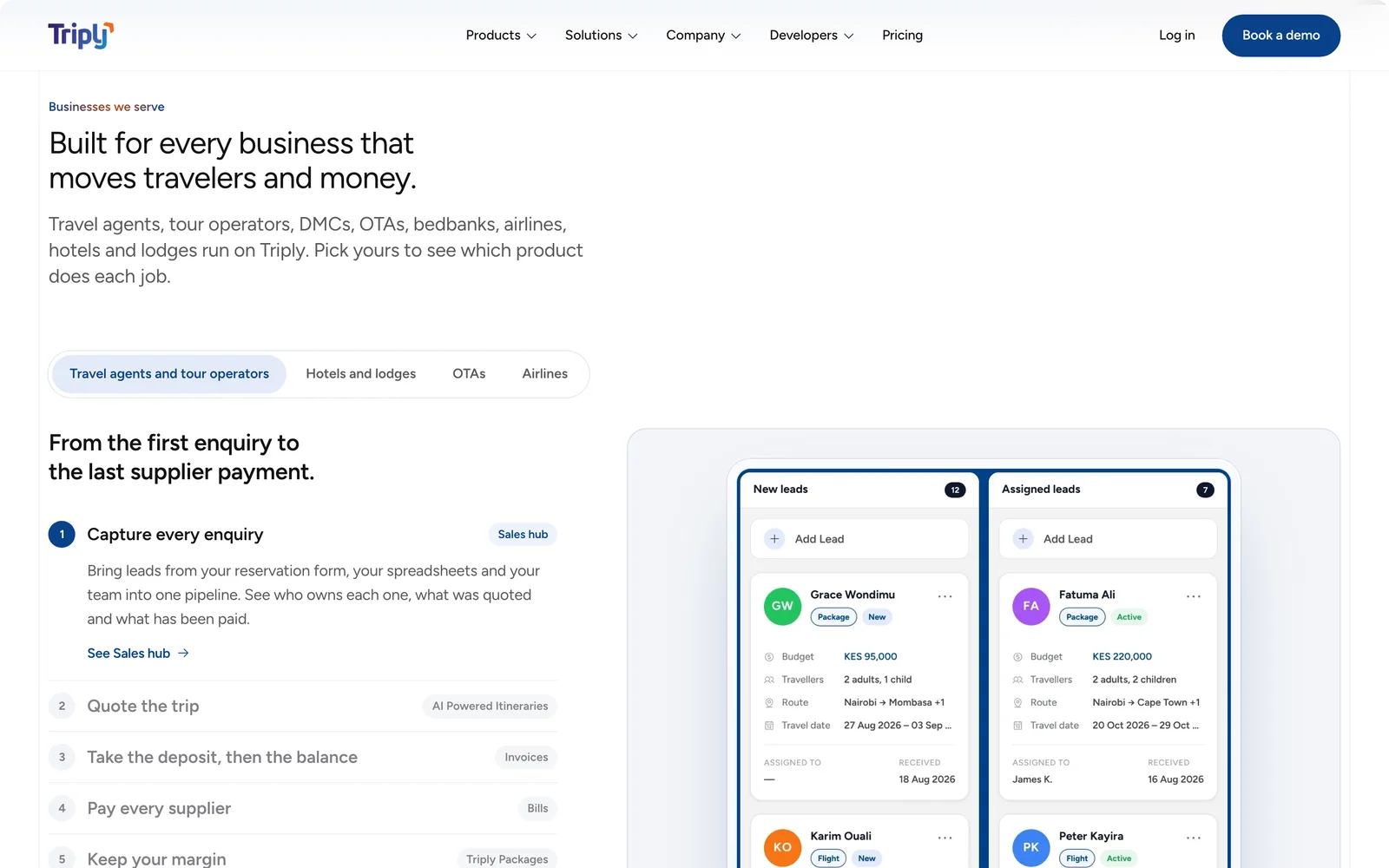
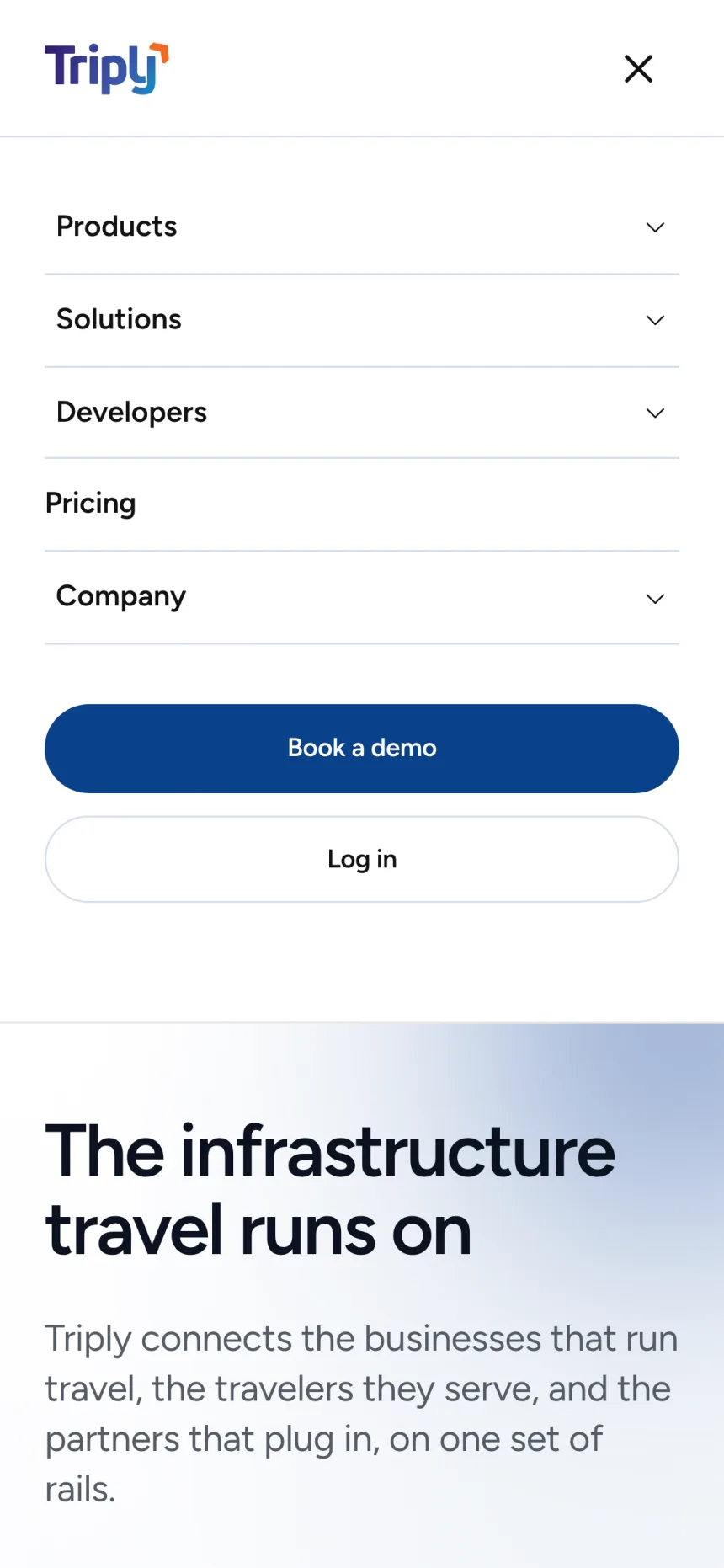
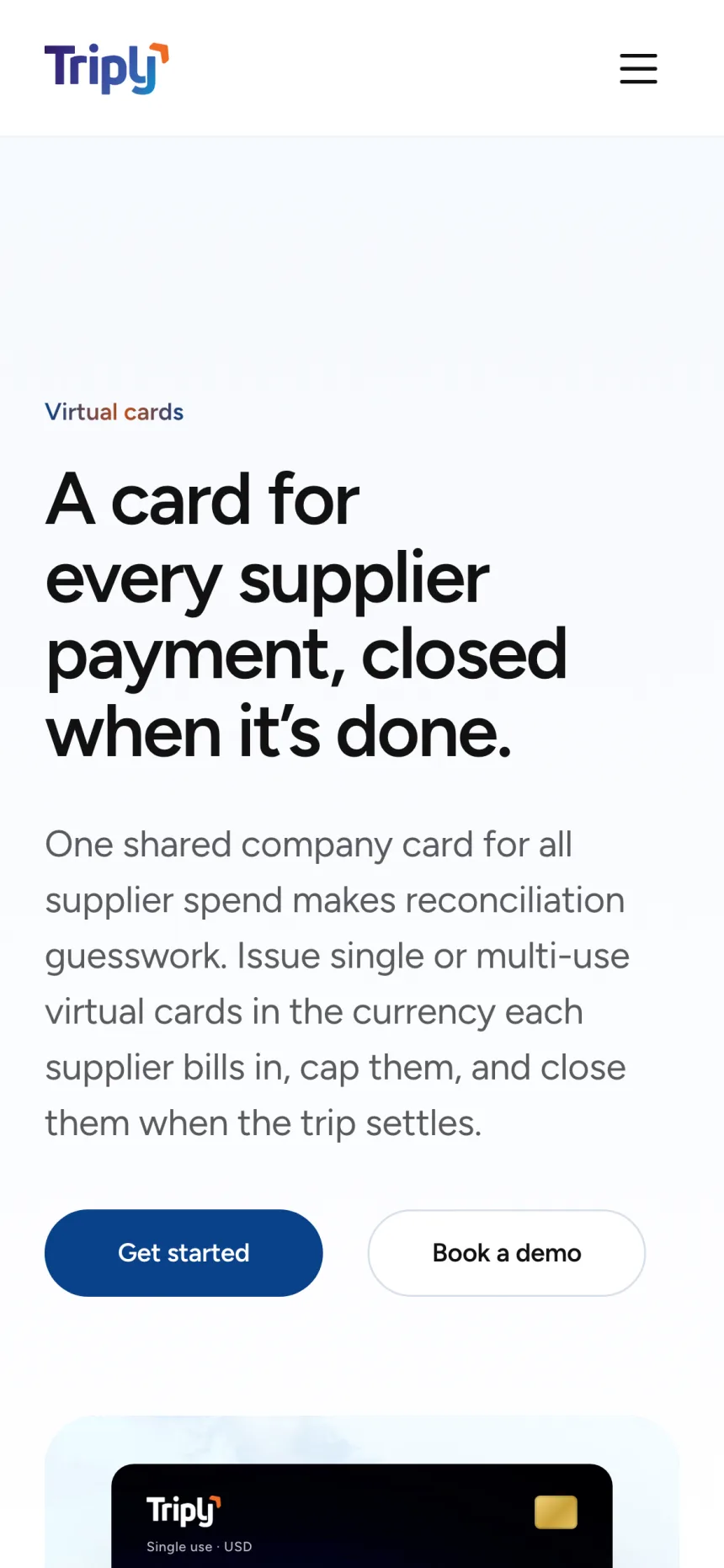
The product pages carry most of the weight. There are about twenty of them, from Collections and Checkout Links to Flights, Virtual Cards and FX, and each follows the same arc: what it does in one sentence, the steps, how you track it, how the money is kept safe, then the questions people ask before signing up.
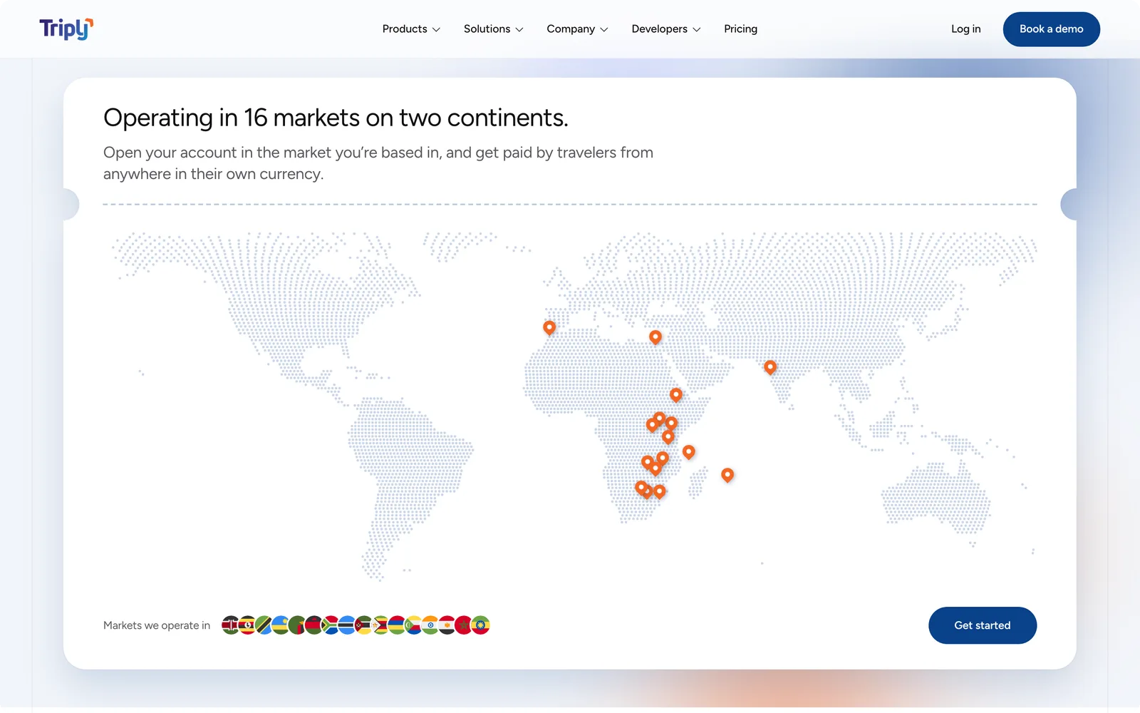
The product graphics are not screenshots and not illustrations. They are rebuilt from Triply’s real interface components in HTML, with sample data drawn from every market Triply operates in, not mostly Kenyan names. That keeps them sharp at any size, lets them respond to the screen, and means they can be updated when the product changes.
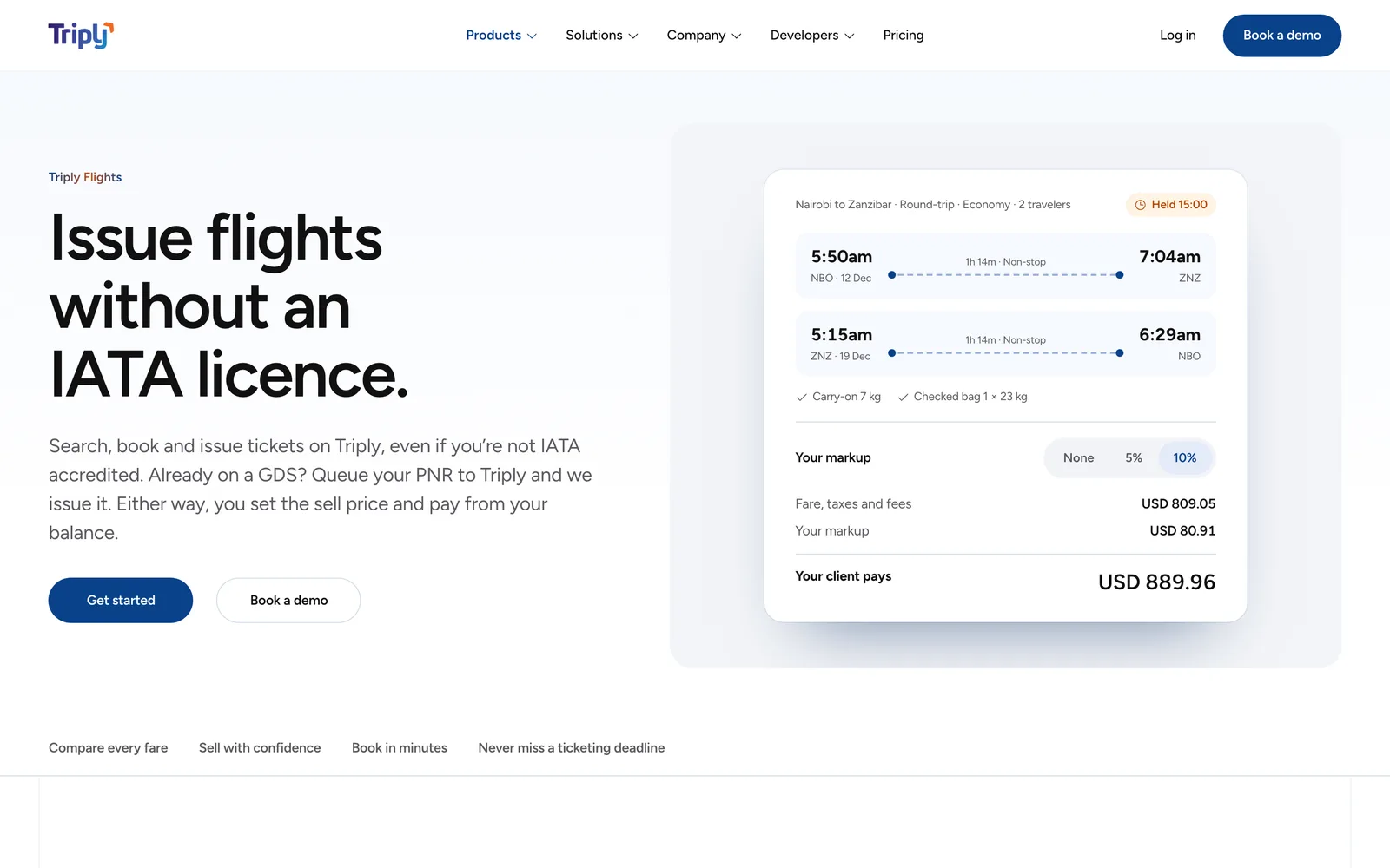
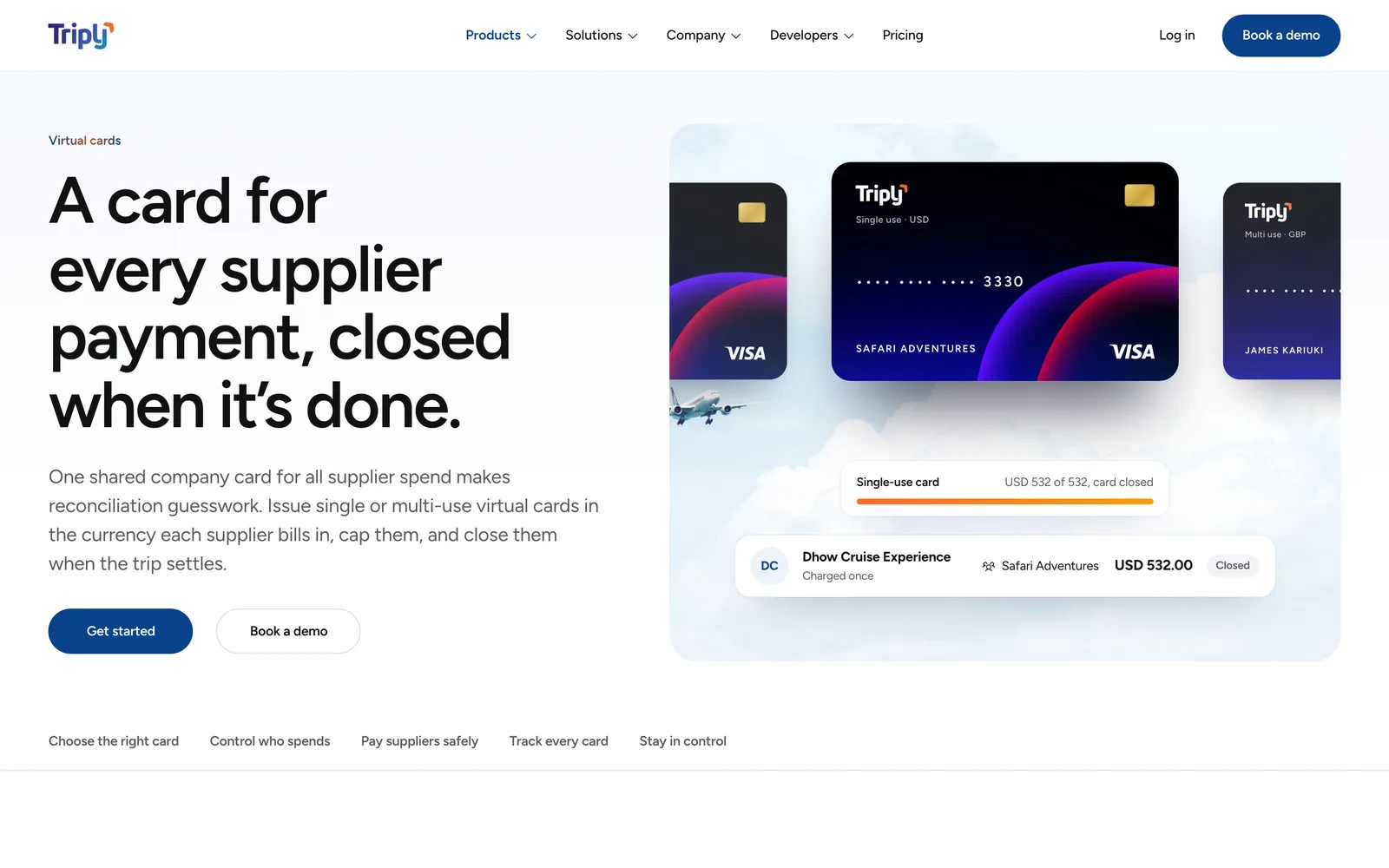
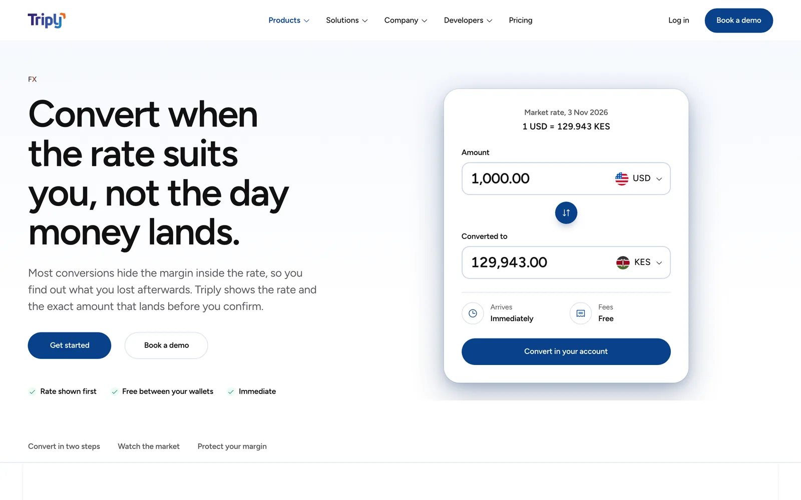
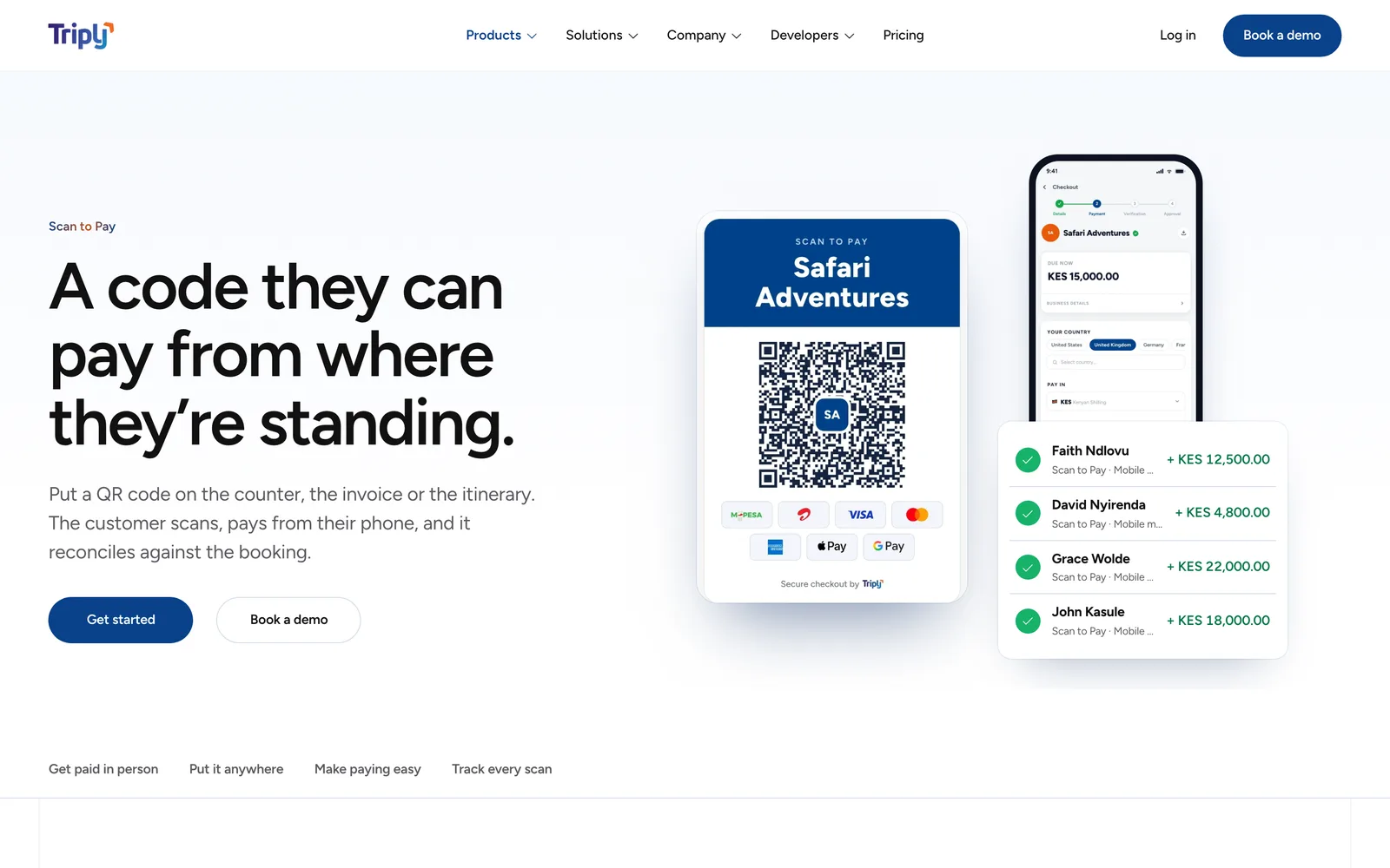
The homepage gathers the same pieces by job rather than by product, so a lodge or an airline can find itself without knowing Triply’s product names.
07The build
No framework, one file.
The site has no package.json and no toolchain. Pages, styles and scripts are written as separate files, and a short Node script assembles them into one self-contained HTML file. I rejected loading views at runtime for three reasons: the copy needs to be in the served HTML for search engines, the file has to open straight from disk for review, and visitors shouldn’t see an empty shell while it loads.
Raw values live in one tokens file, and stylesheets are applied in a declared order. A missing file or an unresolved marker fails the build instead of shipping a gap. The first homepage ran a WebGL shader behind the hero. It lasted a day.
Brand
Navy
#09418A
Blue
#3862AC
Orange
#F46622
Orange ink
#BF4F1A
Ground and ink
Ground
#FFFFFF
Ice
#F4F7FE
Mist
#F2F5FA
Ink
#111111
Ink 2
#5A5A5F
The infrastructure travel runs on
Figtree
One variable family, 300 to 900, self-hosted. The same face as the Triply app
The typeface changed partway through. The site began in Amsi Pro, the brand face, and a teammate moved it to Figtree, the face the Triply app already uses, so the marketing site and the product now read as one thing.
08Where it stands
Live, and still filling in.
The site is live at triply.co. The design bar and its pre-flight checklist live in the repository next to the code, so anyone adding a page checks it against the same list: figures that trace to a source, contrast, keyboard use, and no overflow from phone to wide desktop.
- —Analytics went live in November, tracking every page view and click.
- —The test plan is written down. Below about 5,000 sessions a month, five user interviews replace an A/B test.
TeeOff Club
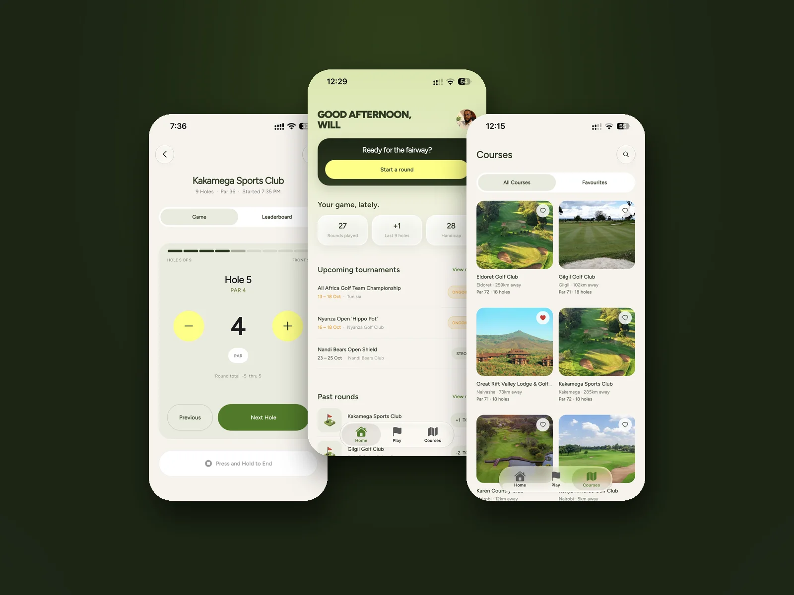
A golf scorecard that keeps the score, so the group can keep playing.