BloomCare+
- Role
- Design & build, solo
- Timeline
- Feb 2026 · two weeks
- Platform
- iOS (Flutter)
- Status
- Working prototype
- Built with
- Flutter · SQLite · Supabase
Introduction
A child’s health passport that starts with the hardest part: logging the day when you’re tired. BloomCare+ starts from a big idea: a health passport that follows a child from birth to adulthood. The first build is the part parents touch every day.
Feeds, sleep, diapers, medication, mood and illness are logged in seconds and kept on the phone. Together they answer the question every parent of more than one child keeps asking: is everyone OK today?
01Approach
Build the daily habit before the lifetime record.
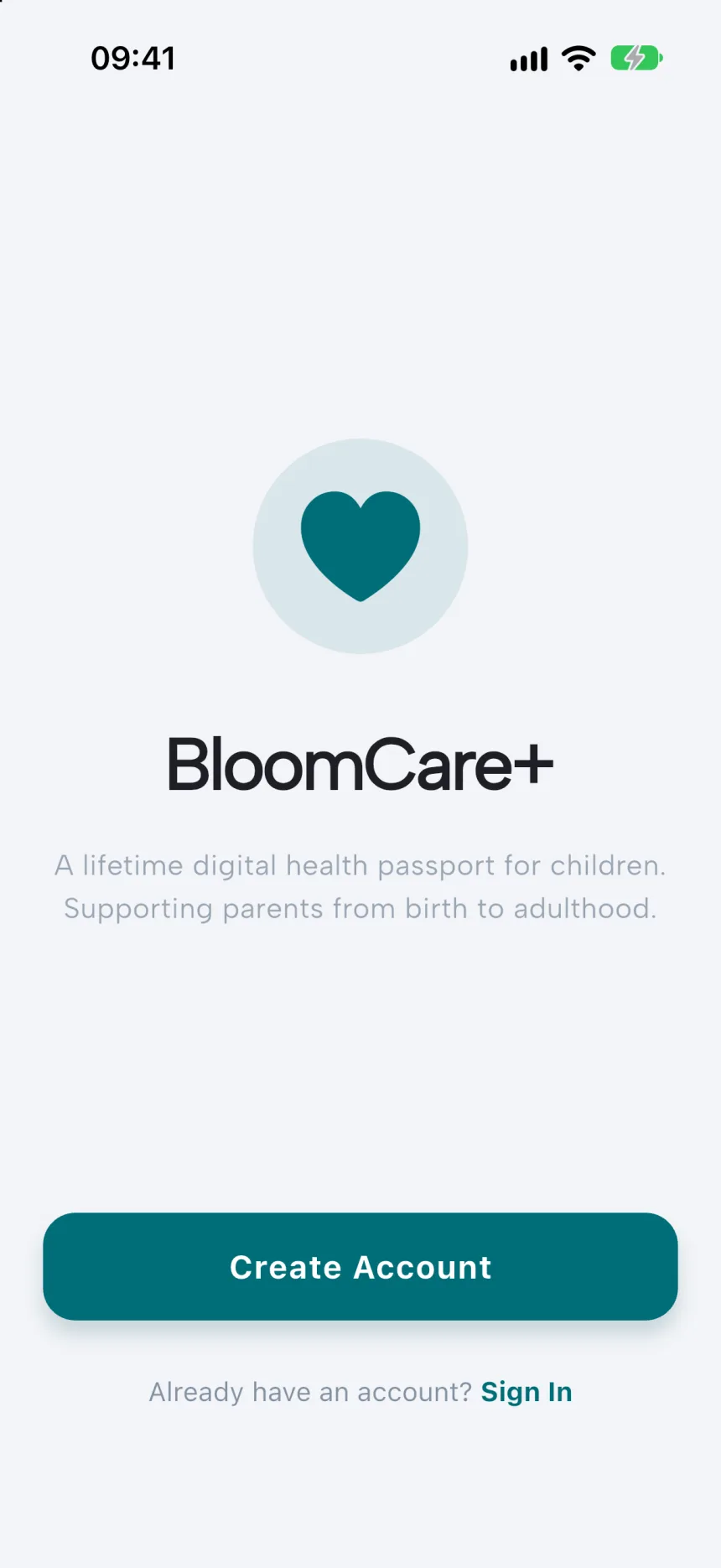
A lifetime digital health passport for children. Supporting parents from birth to adulthood.
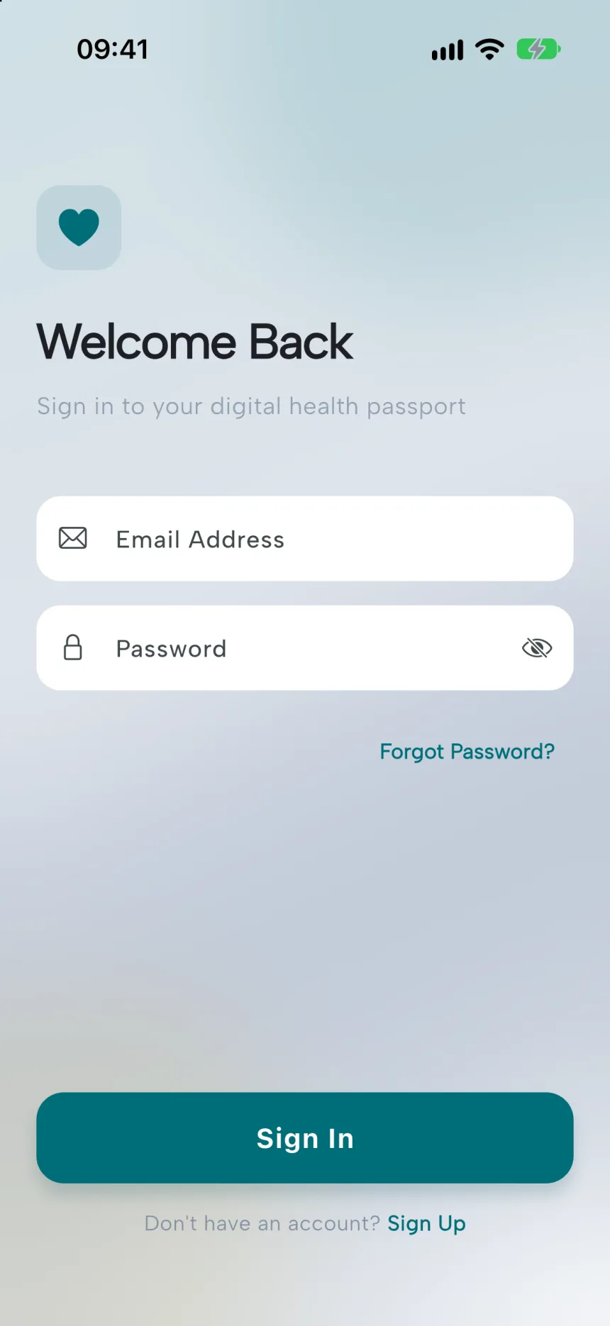
Onboarding
A passport is only useful if it is full, and it only fills up if adding to it is easier than not bothering. So I built the logging loop first and left vaccination and hospital records for later. That loop is one place to log anything, a timeline to check what happened, and a home screen that sums it all up.
I built it in two weeks in February 2026. The first three days covered the core loop, the home screen, sign-in and cloud sync. The rest of the time went on loading states, offline behaviour and the insights.
02Key decisions
Designed for a parent with one free hand.
- 01
One Track button, nine kinds of entry.
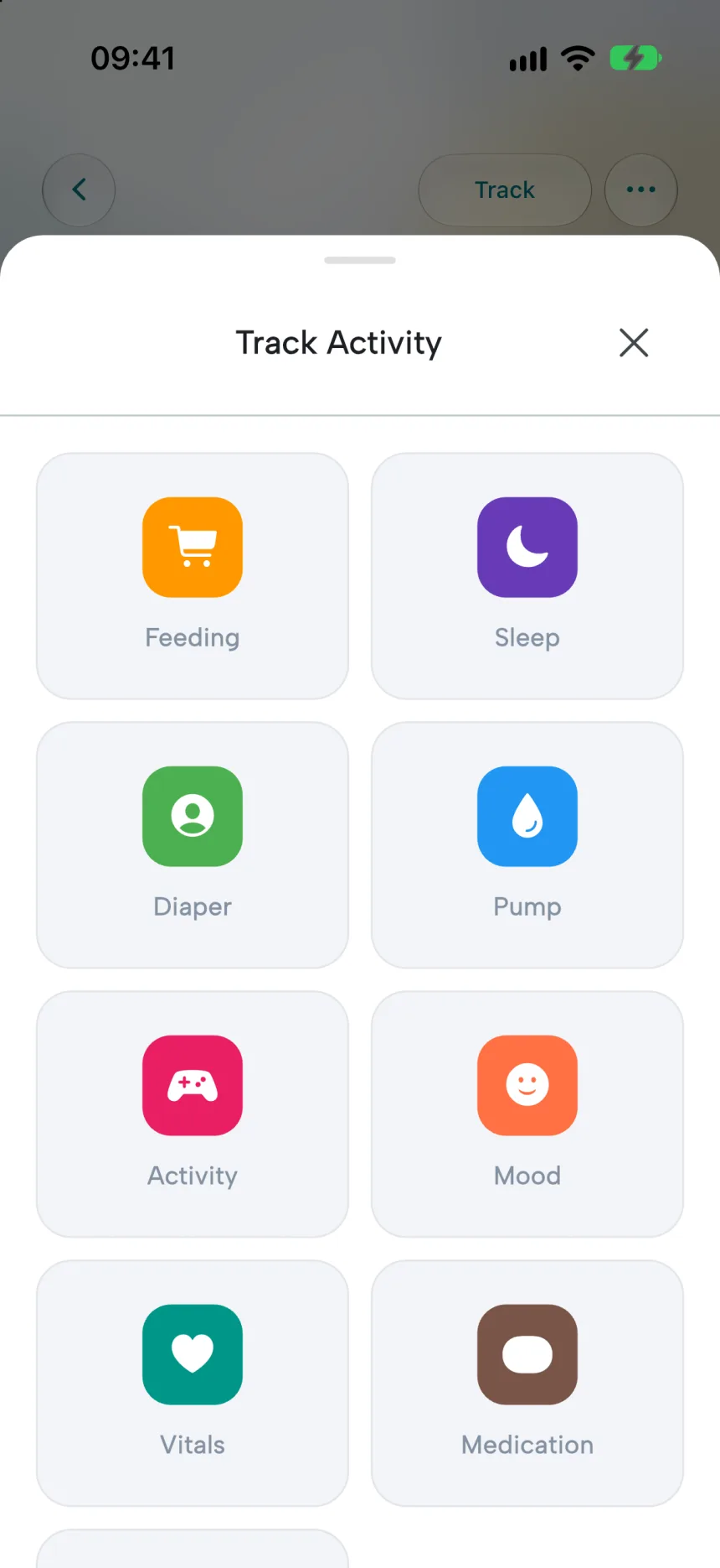
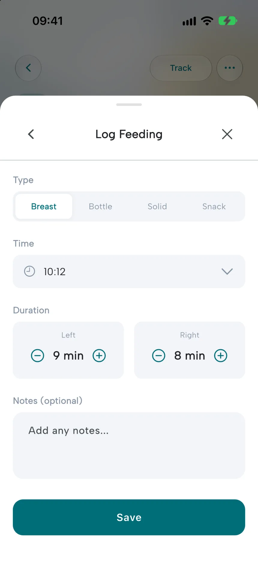
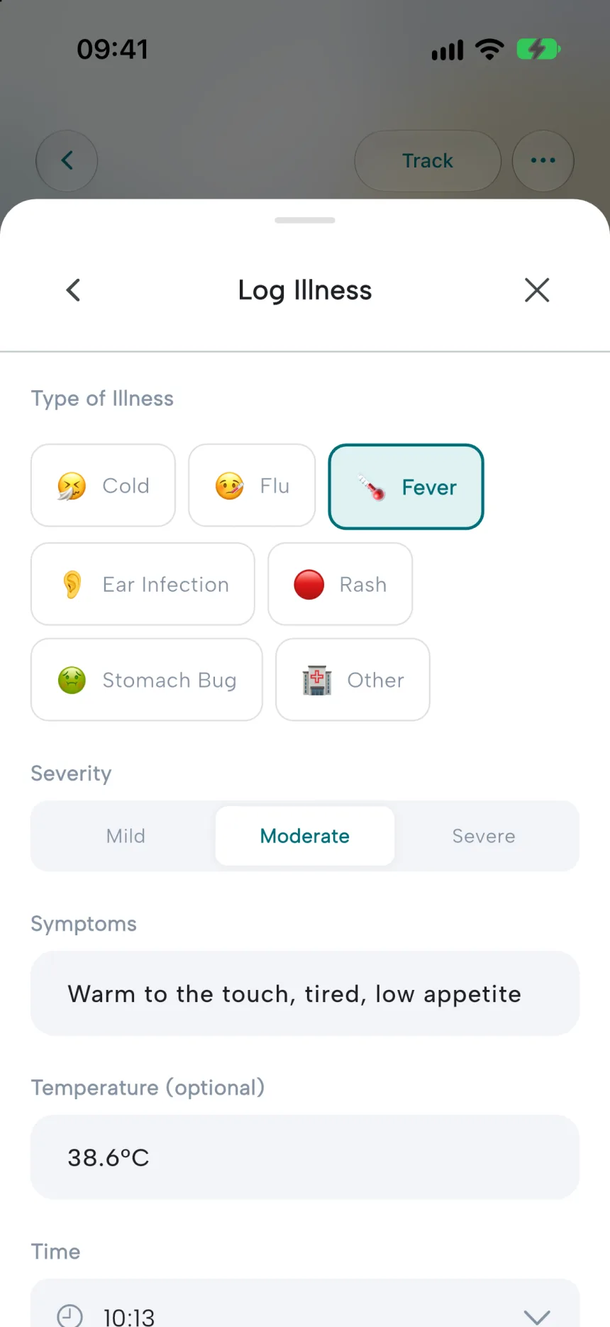
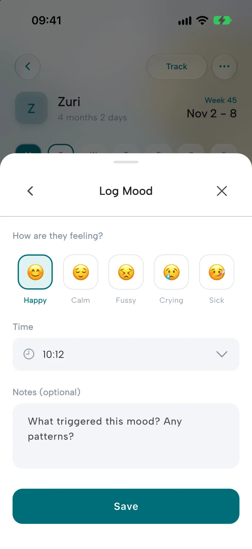
Everything starts from a single button. It opens a grid of nine colour-coded types, and each one leads to a form built for that job. Breast feeding records left and right sides separately. A diaper is Wet, Dirty, Both or Dry. Mood is a row of faces under “How are they feeling?”. Illness takes a severity, the symptoms and an optional temperature.
- 02
One flexible record underneath.
Behind the nine forms is a single kind of event with a type, a subtype, a start and end time, and a flexible data field. When I added illness as a new type, the database didn’t need to change.
- 03
Nothing waits on the network.
An entry appears on screen immediately, is written to the phone, and then syncs in the background. Reads show what’s on the phone first and refresh quietly behind it. A parent logging a 3 a.m. feed should never see a spinner.
- 04
Each child’s card answers “are they OK?”
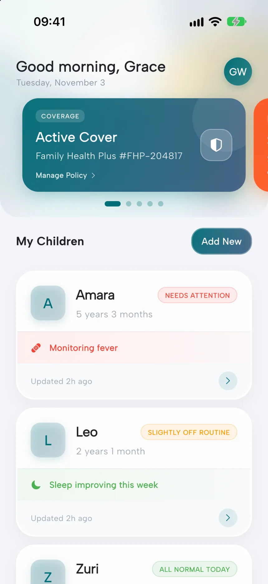
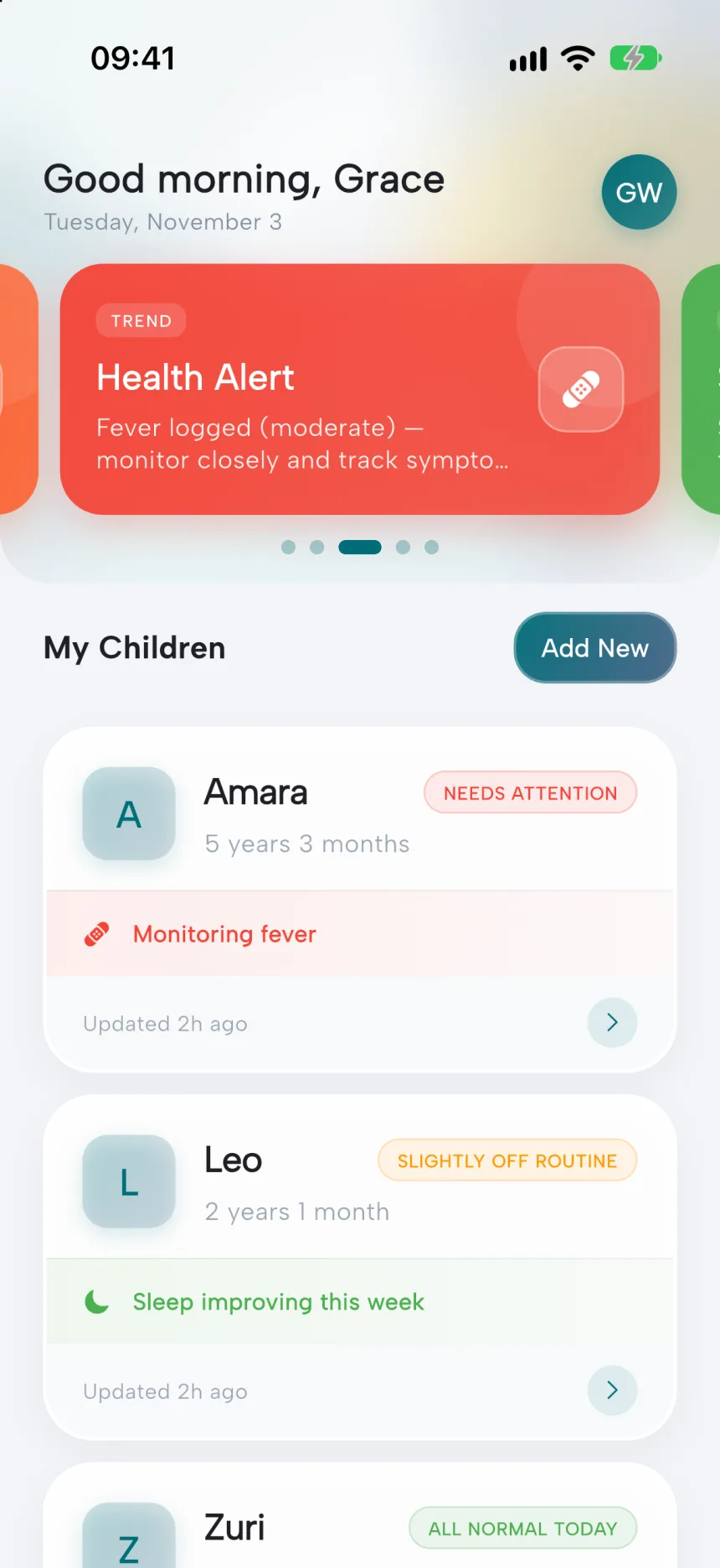
Every child’s card is worked out from today’s entries: “All normal today”, “Slightly off routine”, “Needs attention” or “Start tracking”. Underneath sits the single most important note, such as “Monitoring fever” or “Missed medication yesterday”, plus a plain freshness line like “Updated this morning”.
- 05
Insights from rules, not a model.
The insights compare this week with last week and say what changed in plain words: “Sleep dipped this week”, linked to an illness if there was one. Hand-written rules are less clever than machine learning, but every sentence can be explained, and in a health app that matters more.
- 01
Tap Track
One entry point
- 02
Pick a type
Nine, colour-coded
- 03
Shown at once
No waiting
- 04
Saved on phone
Works offline
- 05
Synced later
In the background
03Structure
The child comes first, the features second.
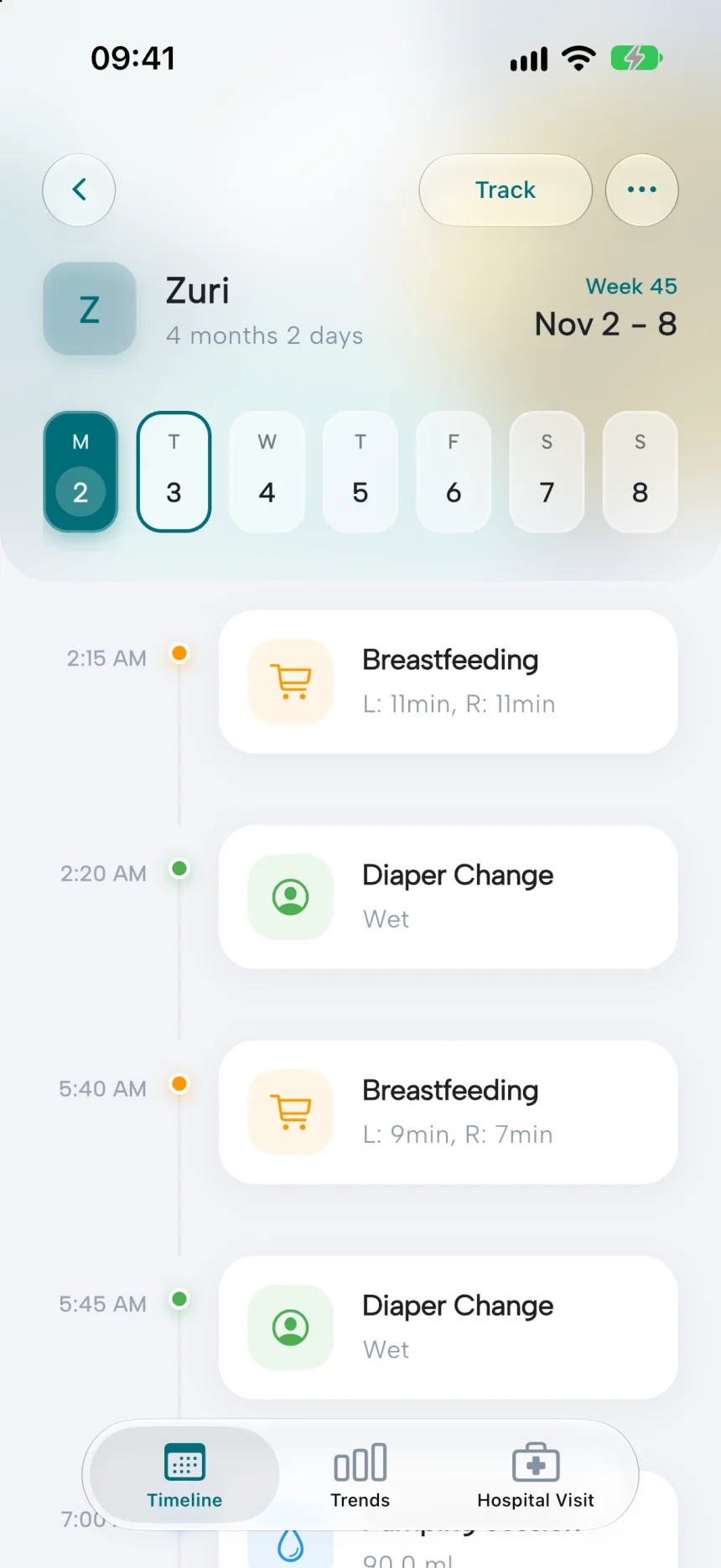
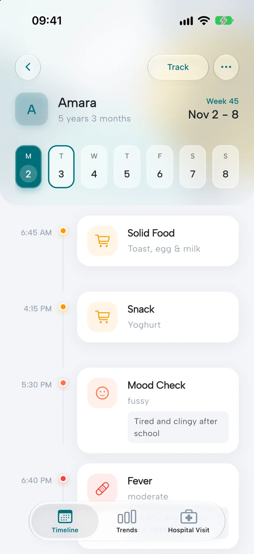
Until you pick a child, the list of children is the whole app. Picking one switches you into that child’s world, with a bottom bar of Timeline, Trends and Hospital Visit. The timeline is a swipeable week across the top, with that day’s entries running down a vertical line, coloured by type.
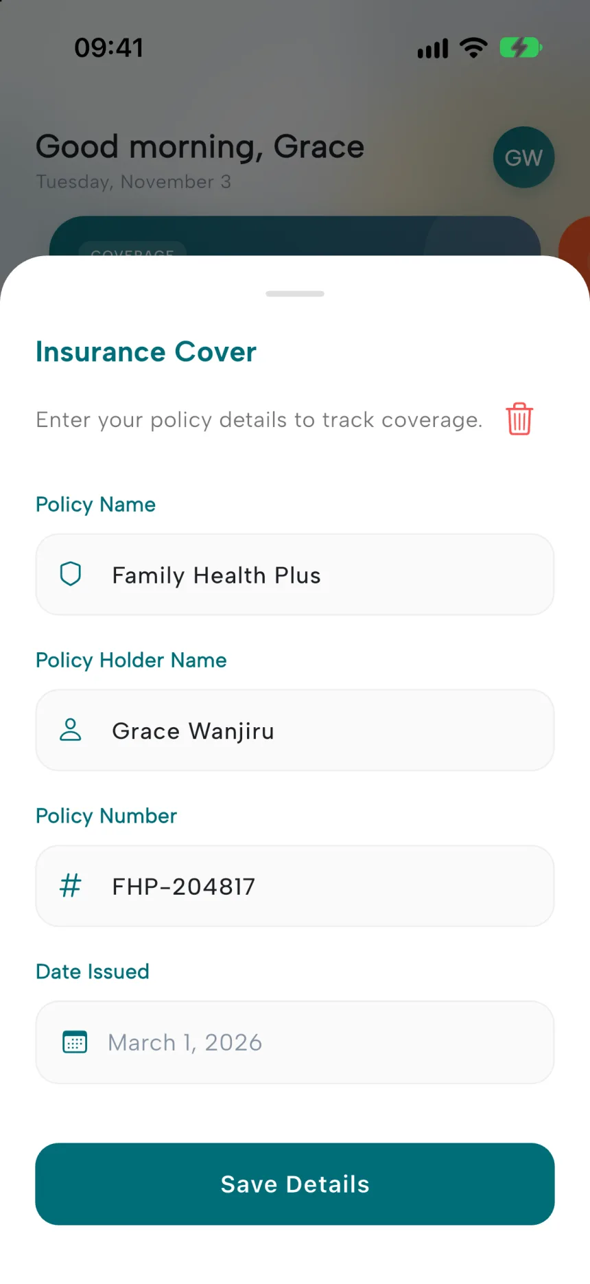
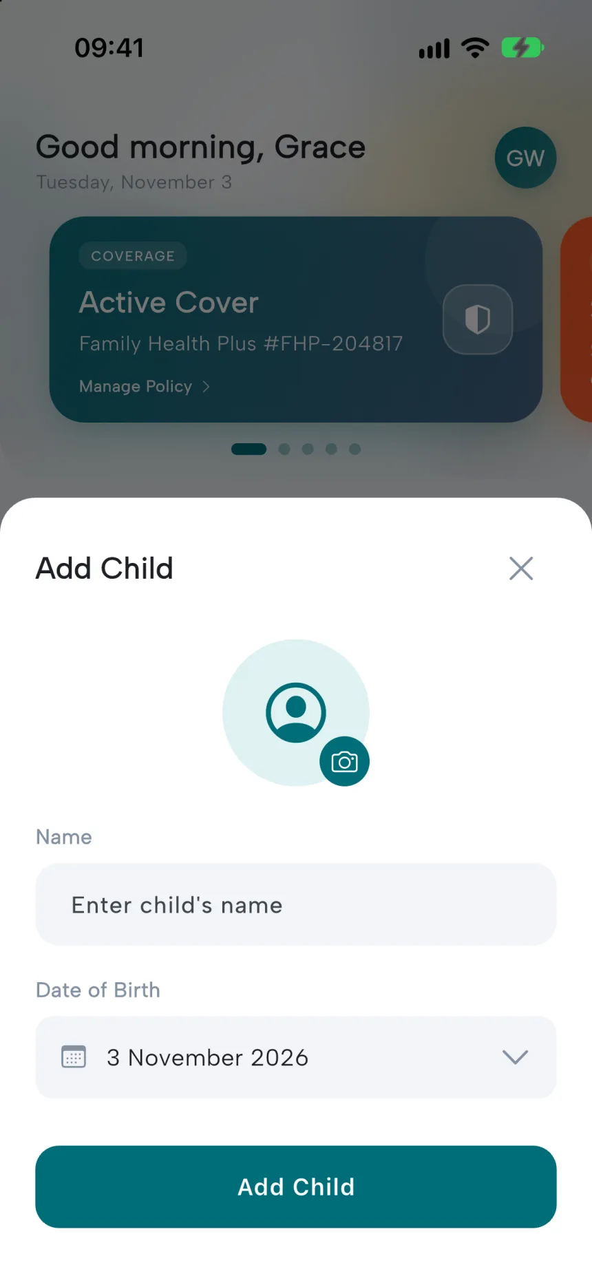
Health insurance is the one thing that belongs to the household rather than a child, so it sits at the top of the home screen as “Active Cover” or “Coverage Missing”. In the app’s own words, that is for easy access.
04What I cut
Starting with a hospital standard, then letting it go.
The first data model used FHIR, the healthcare interoperability standard. Children were stored as patient records and vitals as coded observations. Two days in, I took it out in favour of a plain schema. That week the home screen also went from about 1,300 lines of code to about 280, split into parts I could actually redesign.
The passport vision still points towards standards like FHIR. The prototype needed speed more than it needed to talk to hospital systems.
05Design system
Calm teal, and nine colours that mean something.
The base palette is calm and clinical without feeling cold: a deep teal for action, soft blue-grey surfaces and warm status colours. The nine tracking types each get one strong colour, so the timeline can be read at a glance before you read a single word.
Base
Teal
#006D77
Light teal
#E0F2F2
Blue
#3D5A80
Amber
#FFBF00
Ground
#F2F4F8
Text
#1D1F24
Tracking types
Feeding
#FF9800
Sleep
#673AB7
Diaper
#4CAF50
Pump
#2196F3
Activity
#E91E63
Mood
#FF7043
Vitals
#009688
Medication
#795548
Illness
#F44336
Good morning
Albert Sans
Display 28 bold, −0.5 tracking. Body 16 medium
In the product’s words
- “All normal today”Child card
- “Monitoring fever”Most important note
- “How are they feeling?”Mood entry
- “Tap the Track button to add an activity”Empty timeline
06Where it stands
A working loop, with the passport still ahead.
The logging loop, the timeline, the home screen, sign-in and sync all work. The parts that make it a passport are still to come.
- —Hospital visits and vaccinations, the lifetime record itself.
- —Real trends with charts and reference ranges, in place of the current list of vitals.
- —Encrypting data on the phone, and smarter retries when sync fails.
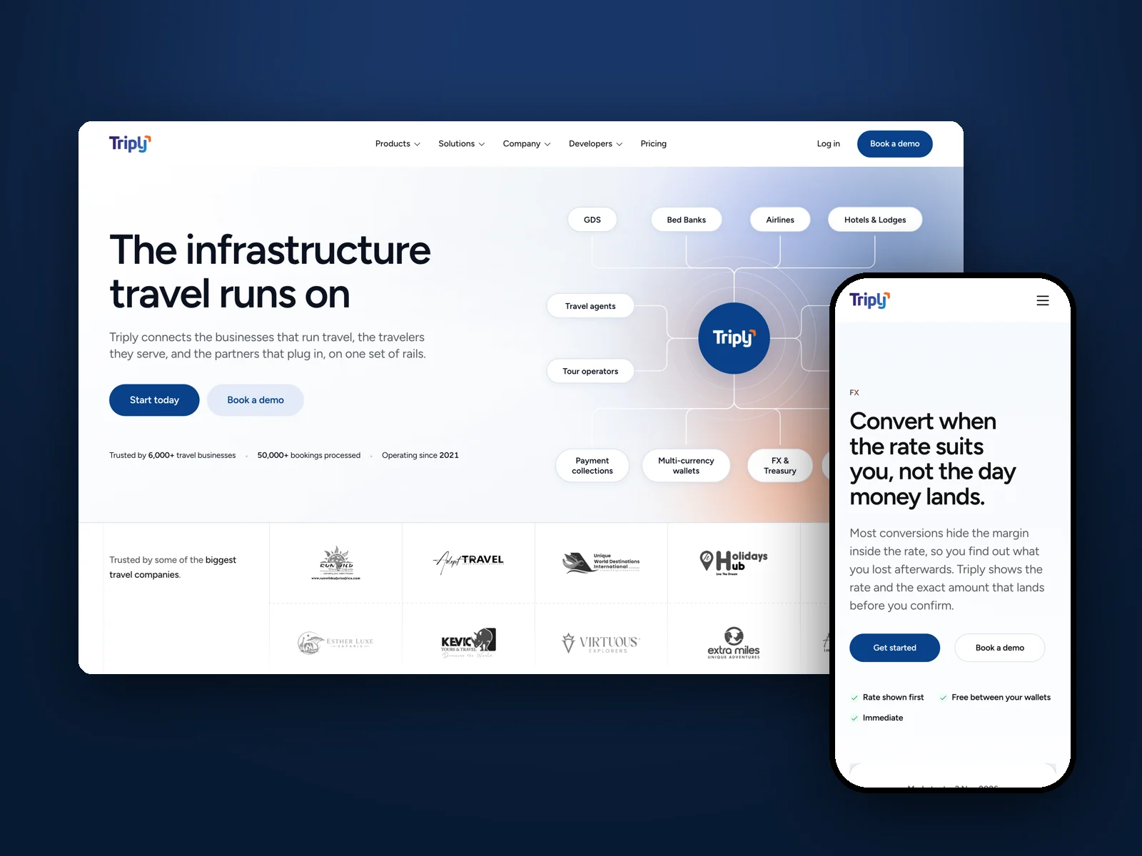
Triply
A website for the payments platform behind African travel businesses, where every claim had to be true before it shipped.